Inpensa Redesign
[Client Project] UX Consulting for a SaaS Software
ROLE:
Lead UI Designer
UX Researcher
PROJECT STATUS
Handed deliverables (research document & spec doc) and presented to client.
TOOLS USED:
Sketch, InVision, Trello, Abstract, Keynote, Illustrator
OVERVIEW
Working with Fortune 500 and Fortune 1000 companies, Inpensa is a SaaS platform that provides effective business value management as a planning and review system for business outcomes: the software manages the end-to-end process from project ideation and prioritization to approval and tracking.
It sets itself apart from the competition by it providing a holistic assessment, which factors both financial and non-financial factors (e.g. alignment to strategic goals, ability to execute, etc.) with their patented formula—shifting focus from simply evaluating the total cost of ownership to the total value of ownership—helping companies make better informed business investment decisions.
SCOPE OF WORK:
The client communicated that they wanted us to conduct a review of the current user experience of the software. As it stood, there was a lot of development that went into the R&D of the product, but not as much research. We were tasked to assess the UX of the software, as well as, focus on the following areas of concern:
Updating interface aesthetics—the current layout is about 5 years old.
Reducing the number of clicks throughs in the product processes.
Improving data layout and navigability.
RESEARCH
Working with the Customer Success Manager, we set meetings with two of the companies current clients: DTCC (Depository Trust & Clearing Corporation) and Cisco. We spoke to a mix of data analysts and project executives to hear about their (1) overall experience and (2) feedback on usability & navigation. We also had them share their screens—a modified contextual inquiry—so they could walk us through some of their daily interactions with the software.
The key takeaways that we got from the user interviews were the following:
PROBLEM STATEMENT:
We found that when using the Inpensa software, analysts & executives find navigation and data management rather tedious.
“How might we redesign the experience to create a more efficient and delightful interaction?”
Who are we designing for?
We’ve designed two personas, (1) Aaron, represents our analyst who use the solution on a daily basis and are responsible for most of the data entry; and (2) Victoria, represents our executives who are interested in the data outputs including reports and dashboards.
DESIGN
With the feedback from user interviews and stakeholder input, we focused our redesign to address the areas of concern:
1. Addressing Older Aesthetics
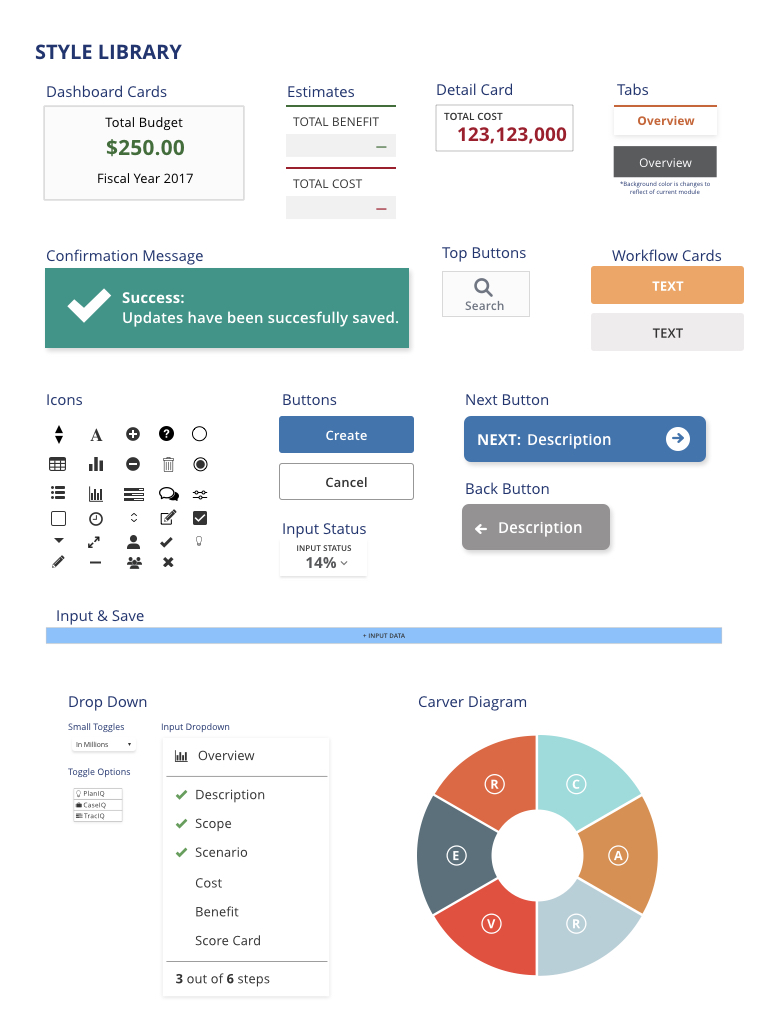
We updated the overall look and feel by introducing a new color scheme between PlanIQ, CaseIQ and TrackIQ modules, setting sticky fixed scroll and sticky elements, creating a style library, among other things.
The main consideration we had when updating the UI elements was keep them close to the original design, because we wanted to give recommendations on things that could be implemented easily and rolled out on the next version of the software; as opposed to a radical overhaul of the software which would mean building things from the ground up.
2. Lack of Navigability and Findability
To improve navigation, we suggested creating hyperlinks (see 2.1) so that users can jump to details and related elements right from the dashboard. We also included a section for the Input Status dropdown (see 2.2) to represent the progress users have completed, as well as, adding Back and Next buttons (see 2.3) to reinforce the sense of succession that happens in the processes throughout the software
For finding things, we proposed an advanced search feature so users can search for keywords filtered between case modules, project IDs, and project attributes.
3. Tedious data entry and difficulty viewing data
Added an +Input Data button at the end of each row as a supplementary method to enter edit (✎) mode.
Using the fullscreen functionally (⤢) to be a better way to view and manage data, similar to a spreadsheet view of the table: consider introducing features where users can adjust row and column heights, as well as freezing panes to allow them to manipulate large quantities of data at once (and facilitate data entry).
VALIDATING THE DESIGN
On the journey to our final prototype, we conducted two rounds of usability testing to test the validity of our design assumptions with five (5) participants in each round.


