Sprinting TO A NEW DASHBOARD
TEAM:
Ted Lee 🙋🏽♂️- UX Designer
Yunshan Wu - UX Designer
Tenten Obillo - CX Architecture
Lei Aspe - User Research
Nina Li - User Research
Franz Weber - Brand Strat
Ellison Chua - Customer Lifecycle
Jedd Flores - Tech
Rox Reyes - CX and Ops
Charz Mendoza- Facilitator
Chris Manguera - Decider
+ more guest
PROJECT STATUS
Completed and launched the refreshed GCash Dashboard + Log-In in Aug 2018, as part of the brand refresh efforts
TOOLS USED:
Sketch, InVision, Trello, Abstract, Keynote, Illustrator
Overview
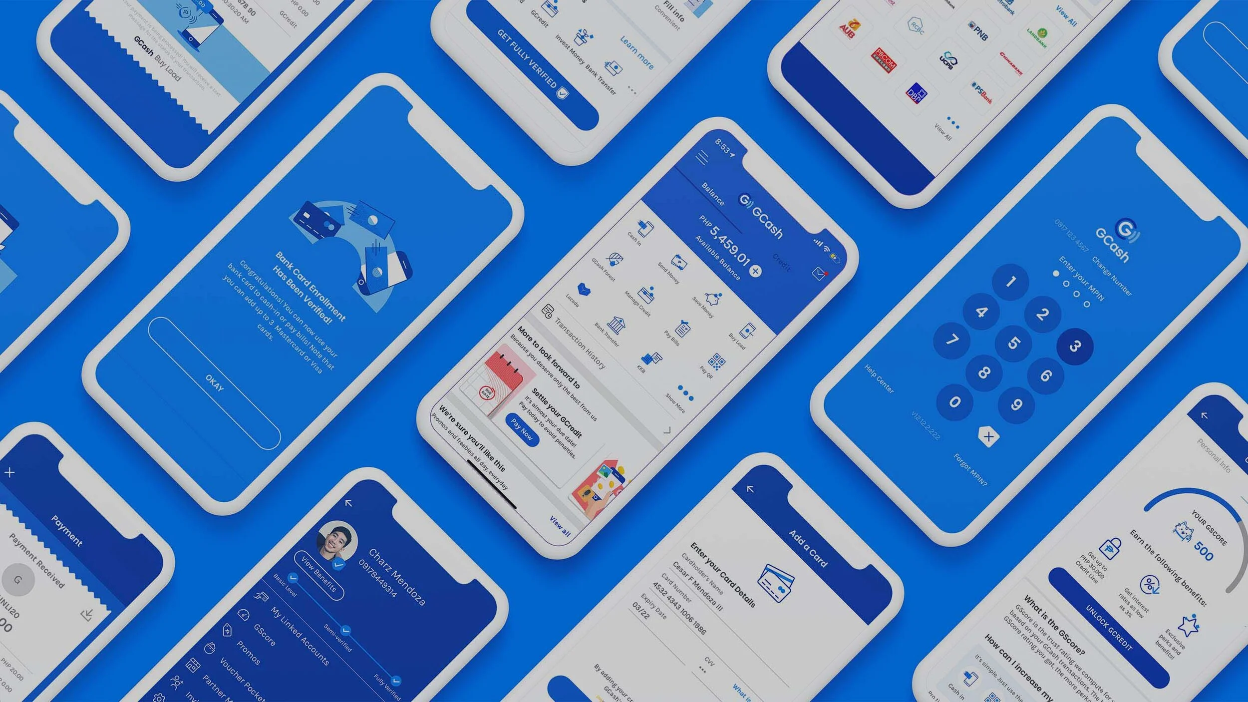
As part of the GCash Brand Refresh, the team wanted to do a revamp of the GCash app starting with the app dashboard—as the first thing users see once they log in and the main entry point to all other services.
The team undertook a 5-day design sprint in order to ideate, create and validate the best possible approach. The following will be a recap of the progress of each day within the design sprint.
A progression of GCash Dashboard over the years
Research and Direction
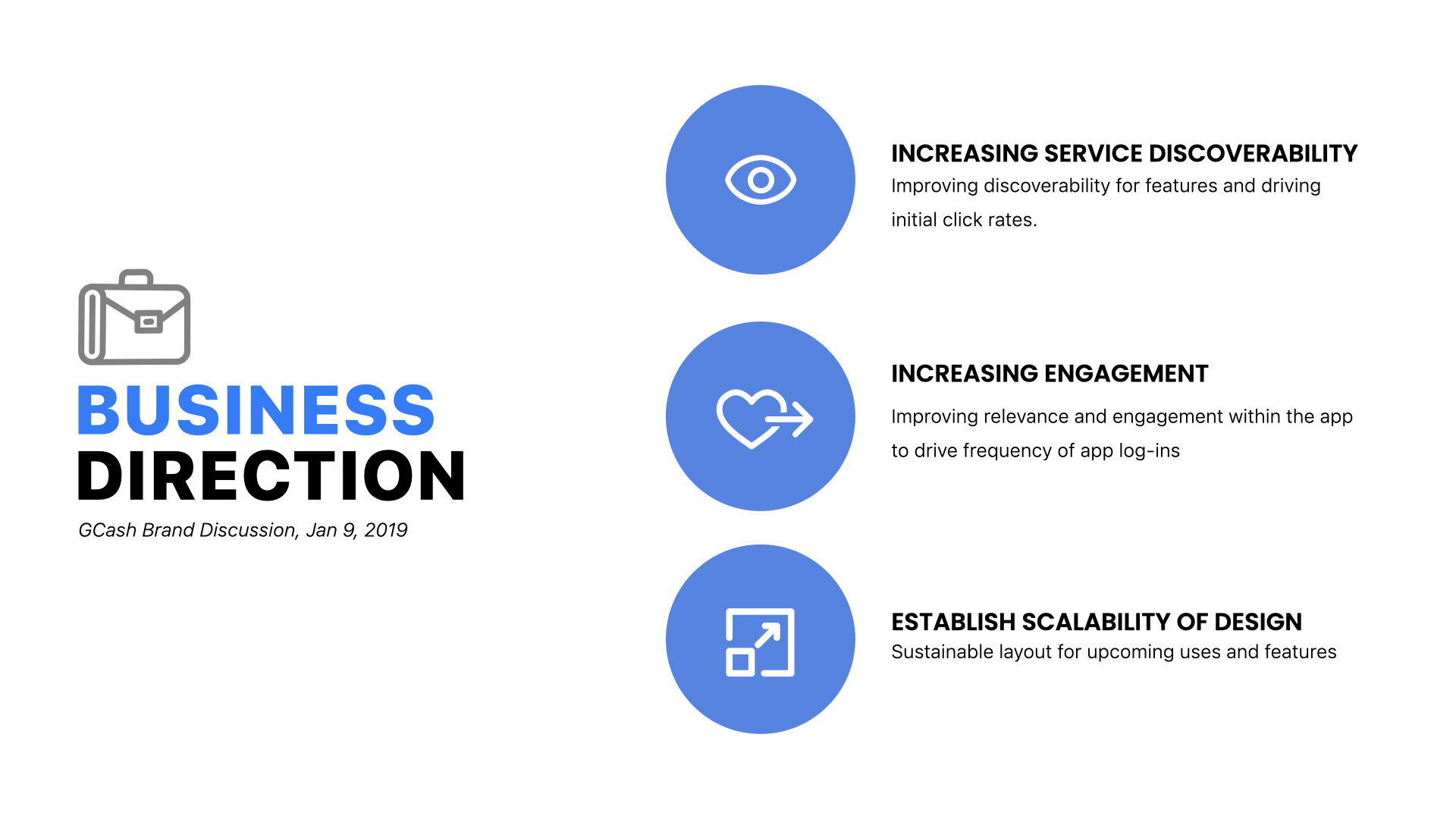
In order to set the context of the sprint moving forward, we presented some of the key takeaways from (1) user research done on the current dashboard and its architecture, and (2) the business direction that was set during the GCash Brand Discussion aligned the week prior.
With these in mind, we began our 5-day sprint:DAY 1: Making a Map
Setting out Goals
The key outputs from Day 1 were being able to identify the long-term goals that we wanted to achieve:
Customer Journey Map + HMW Statements
For this exercise, we mapped out the customer journey: from introduction to the first transaction, and chose to focus on how we can convert mobile wallet beginners, highlighting the key HWM statements:
HMW use the dashboard as a springboard for learning and discoverability
HMW convince users to link and cash-in as soon as possible.
Day 2: Sketching Ideas
LIGHTNING DEMOS
We started the day with lightning demos where Yunshan took the team through different dashboard layouts that the ANT UED team has worked on, as well as the different challenges behind each redesign process, as well as, some sharing of things the team has found.
This exercise was a way to be able to learn and draw inspiration from existing e-wallets across South East Asia.
Fleshing Out the HMW
We wanted to understand how can better serve our mobile wallet beginners by narrowing down our HMW into:
What do I want to learn?
What should I be able to discover?
Solution sketches
From the morning shares and discussions, the team began a process of ideate-sketch-refine to each come up with dashboard layout ideas.
(Everyone eagerly and seriously sketching out their ideas, in our very messy, tiny room 😂)
Day 3: Storyboarding
ART MUSEUM AND DECISIONS
The team went through each other’s proposed solution: first silently reviewing and voting on the outputs, then having an open discussion of each design.
The chosen solution became a mix of the top right image serving as the base structure for the revised dashboard; at the same time, adding on standout elements from the other proposed solutions (bottom two).
Proposed Solution
Day 4: Prototyping
Preparing the prototype
Before going into the thick of prototyping, the team identified four main sections that should be included in the iterations of the prototypes:
Funding / Cash-In Section - show users a consolidated list and easy access to Cash-in options
Action Cards - section will be for engagement giving users a set of tasks to set up accounts and optimize their experience on the app.
Promotions & Feed - promos banner section that can highlight brand partners and promotions.
Navigation Bar - includes the following
Home
Rewards (includes vouchers, voucher marketplace)
Transaction History
Help
Me (Profile)
Design Feedback Summary:
Day 5: User Validation
User Interviews:
With six participants recruited for the experiment, the team set up a room for interviews and another room for observation. The questions for the usability test were centered around the following:
Initial perceptions of the dashboards presented
“What do you want to do first on the homepage?”
Validating design elements and expected behavior: focused on the 4 elements
“Is there anything else you'd want to change on the homepage?”
PoST PROCESSING SESSION + SUMMARY
Next Steps
With a structure created and validated, we adapted the winning prototype features into the GCash branding:


